Design Principles
The Eryxon Flow design system is a modern, multi-theme UI framework built for manufacturing professionals. It supports dark, light, and auto (system preference) modes.
”The Simple MES You Love to Use”
Section titled “”The Simple MES You Love to Use””Our tagline drives every design decision:
- Simple: A single glass card centered on an ambient stage keeps the focus on the task.
- Beautiful: Animated gradients, neon pills, and microcopy echo a premium, tech-forward aesthetic.
- Functional: Touch-optimized layouts (44px+ targets) remain practical for shop-floor tablets.
- Professional: Enterprise-grade typography, accessibility, and predictable motion.
Theme Modes
Section titled “Theme Modes”The system supports three theme modes:
| Mode | Behavior |
|---|---|
dark | Default for low-light facilities. Reduces glare on the shop floor. |
light | Optimized for well-lit offices. Improved WCAG AA contrast ratios. |
auto | Follows system/browser preference (default). |
Visual Aesthetic
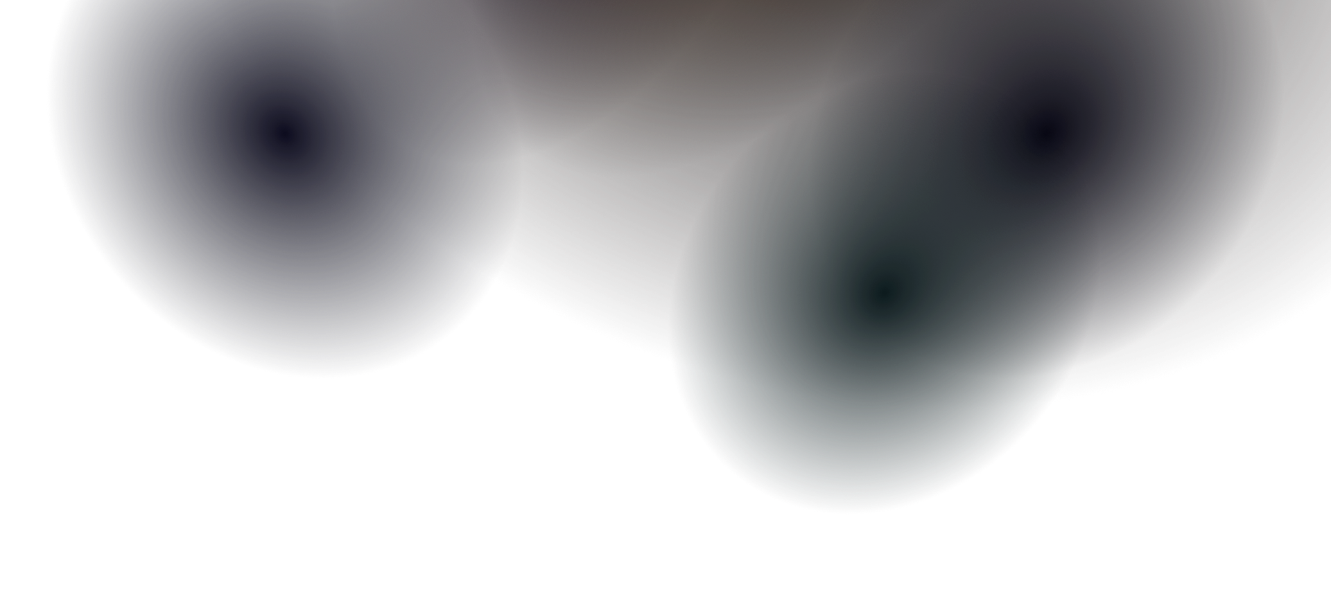
Section titled “Visual Aesthetic”- Ambient Field + Depth: Backgrounds use radial gradients; floating orbs add parallax.
- Glass Cards: Hero surfaces use
backdrop-filter: blur(16px) saturate(180%)with translucent borders. - Status Icon Tints: Blue, green, yellow, and red strokes for semantic meaning.
- Narrative Sections: Layered messaging with icon containers, welcome text, and preview pills.
Best Practices
Section titled “Best Practices”- Start with shadcn/ui: Use generated components and extend them with design system classes.
- Use Tokens Everywhere: Reference shared CSS variables for all colors, spacing, and radii.
- Layered Glass Depth: Stack content over the animated background with glass cards.
- Micro-Interactions: Use smooth transitions, hover effects, and entrance animations.
❌ Don’t
Section titled “❌ Don’t”- No Flat Backgrounds: Avoid solid black or gray backgrounds; use the ambient navy with gradients.
- No Opaque Cards: Every card should have a blur effect for depth.
- No Arbitrary Spacing: Stick to the spacing scale defined in Design Tokens.